SAI Platform
Website Architecture / UX / UI | Designer at Wolf&Player
2019 | with Sustainable Agricultural Initiative Platform

How do we educate, connect, and enable members to play their part in the future of sustainable agriculture?
Create two new areas of the main site that educate and inform users on FSA (Farm Sustainability Assessment), and enables greater collaboration and resource delivery with a new Members’ Area.
Two new website sections architected and designed, that enabled the acquirement of new company members, increased user retention, and the provision of resources that help facilitate SAI’s vision.
To feed the world in 2050, global food production will need to double as a result of an ever-growing world population.
SAI Platform (Sustainable Agricultural Initiative Platform) is one of the primary global food and drink value chain initiatives for sustainable agriculture. They are a non-profit network of over 100 members worldwide, catalysing change and driving sustainable practices so that we can develop and implement sustainable agriculture, now and for the future.
Following the success of the Wolf&Player’s redesign of their main website, it was proposed that we create two new sections to the site; FSA, and a Members’ Area.

The FSA is a means to show how committed a company is at “promoting reliable, sustainable food production now and for the future”.
It aims to improve insight into agricultural value chains and provides a framework that can be benchmarked to demonstrate how you measure up against an internationally agreed standard.
We worked with SAI Platform to create a set of three web pages; One to inform users on FSA as an initiative, one to educate and provide resources, and another as an FAQs.

As this was a new direction for SAI Platform, we worked closely with them to discover what their needs and wants were, and identified user-centric solutions that enabled a functional and efficient experience.
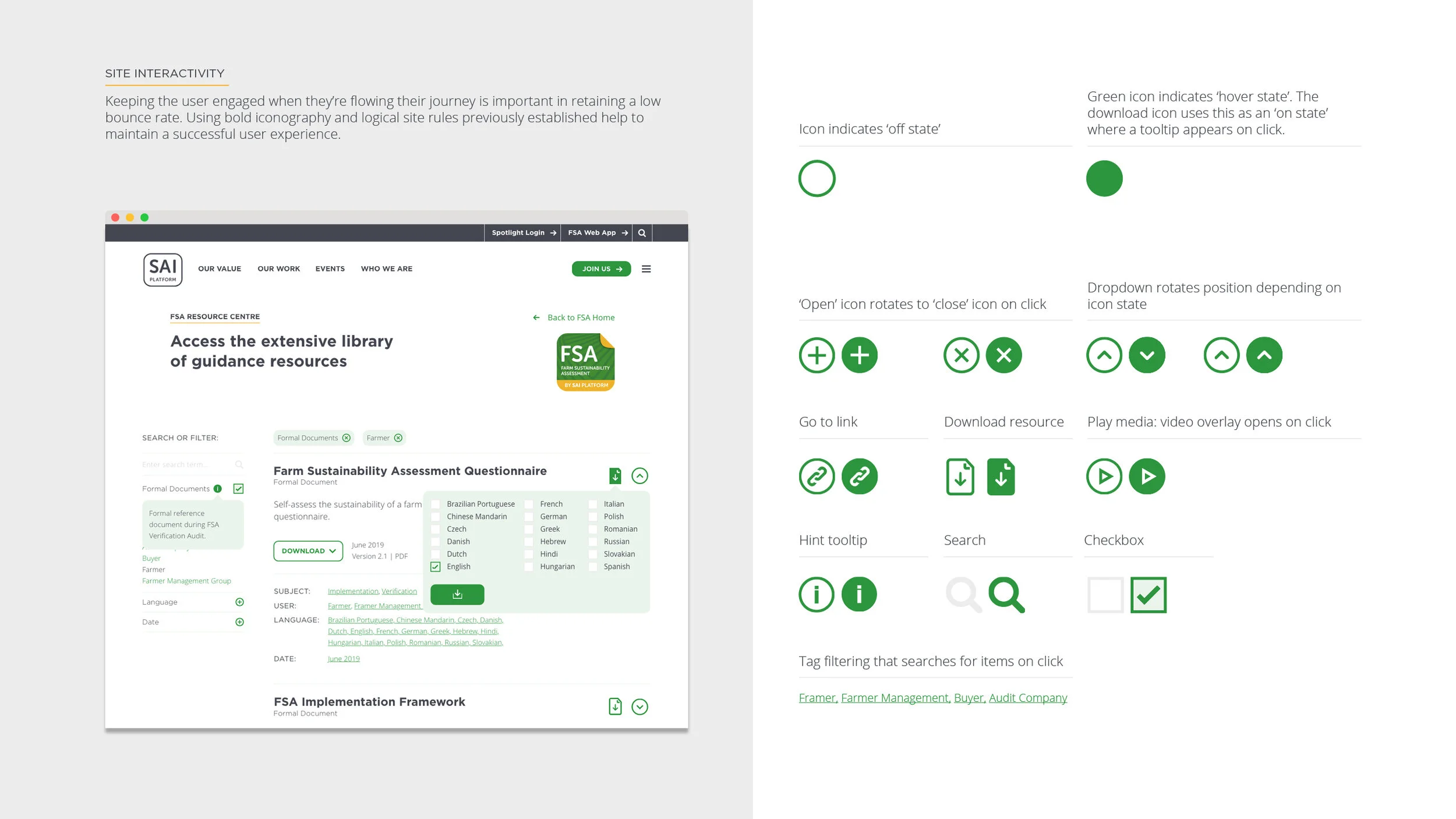
We implemented the catalogue of resources, using a simple search and filter function, tagging resources in ways that would make most sense for the user. Tooltips enable for more information, at the cost of less page clutter, and creating dropdown enables users to see what they want, when they want.
Content blocks and elements such as these were replicated for the FAQs section, to ensure a consistent experience across the site. These items would go on to further inform the Members’ Area’s architecture.
The Members’ Area is a private hub that enables users to network, learn, and utilise tools that will lead to greater agricultural practice.
It started with a workshop in Brussels (their HQ) where the creative director and I investigated and established exactly what they needed and wanted from the MA. The wire framing and resulting designs are a direct reflection of this.


Pages like the Knowledge Base boast a vast amount of content for users to educate themselves on and utilise in their day to day. Creating a sense of familiarity to SAI’s visual system was key here, and so was building on FSA’s functionalities and user experience — making it more appropriate for a section more complex in its build.


