Refreshing a parents coaching service
Branding
Designer at Wolf&Player (now Made for the World) | with Bernard van Leer Foundation
How do we refresh an established brand that combines coaching for parents, with services that meet families’ basic needs?
Opportunity
Refresh the Parents+ brand.
Outcome
A refreshed brand that places onus on the support and guidance that Parents+ provides.
About
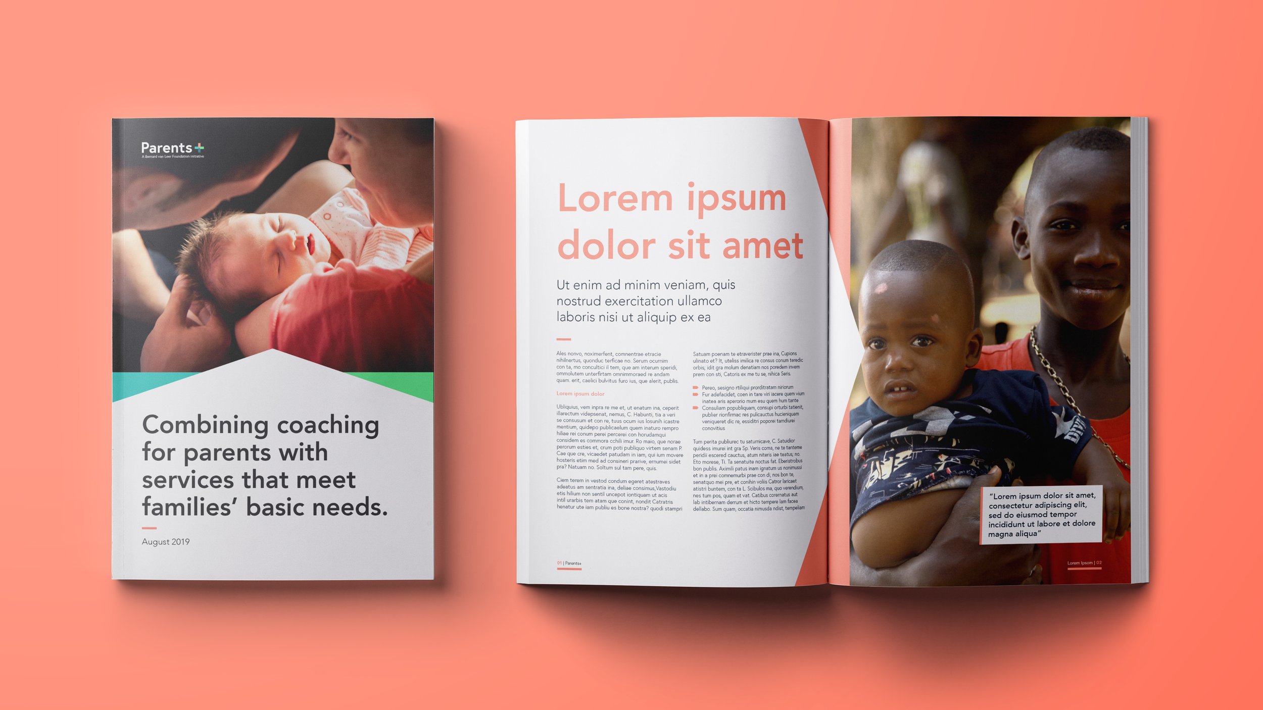
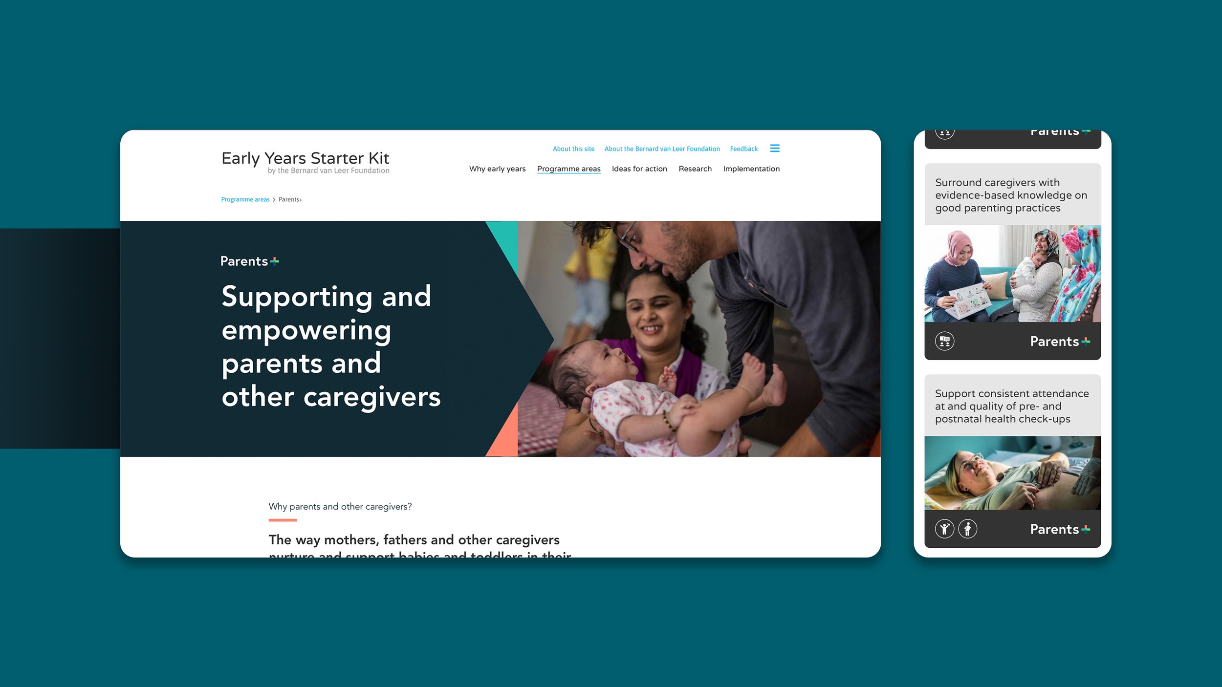
Parents+ is a branch of the Bernard Van Leer Foundation and combines early-years-focused coaching activities for parents and caregivers with at least one other service to meet a child’s and/or parents’ basic needs.
The support children receive in their early years from parents and other caregivers is decisive in their healthy development as they grow older. Whilst many succeed at providing babies and toddlers with a good start in life, many need additional resources and support to enable healthy development for their child.
They use insights from behavioural science to improve impact as they seek to engage with policymakers, civil society and other stakeholders to build policy structures whilst creating key programmes directed at specific vulnerable populations.

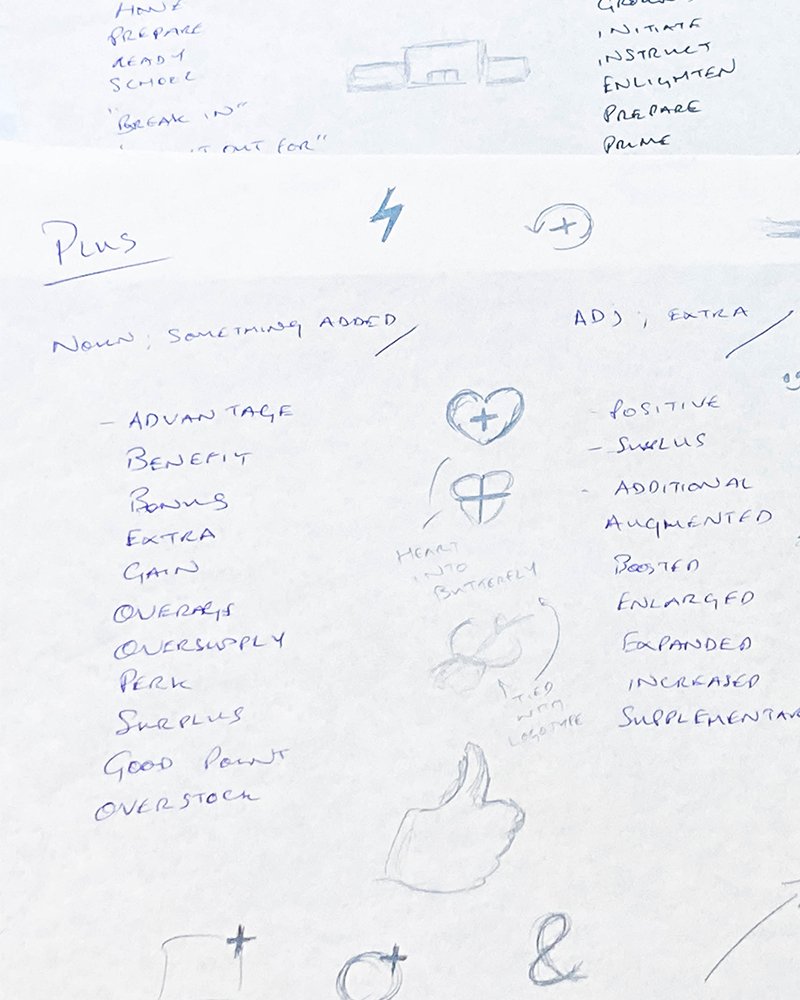
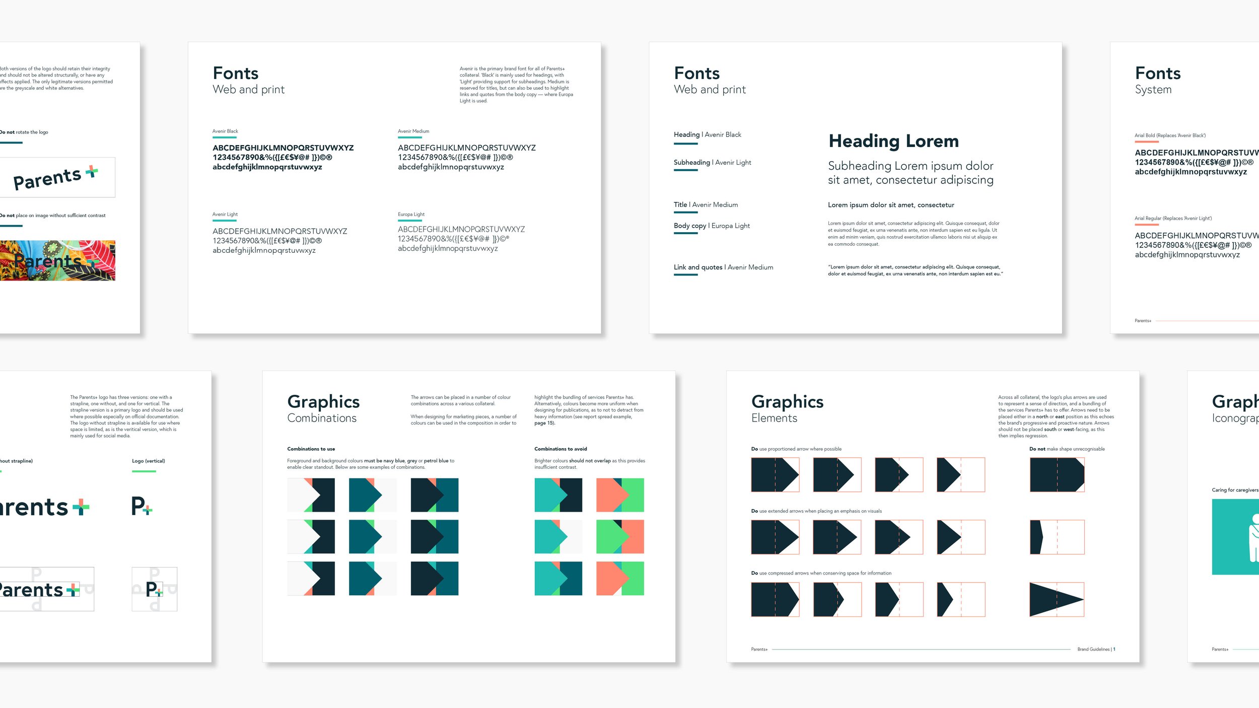
The “+” symbol is an integral part of the branding, as it defines how Parents+ not only provides coaching to caregivers, but provides them with further services to help their own and their child’s development.
There are four keys areas that Parents+ look to provide services for: women’s health, nutrition and childcare, child health, and parent’s coaching. Since the nature of Parents+ is about signposting and guidance, we found that each arm of the “+” can become an arrow, which when paired with a specific colour, would represent those four core brand services.
The tone of the visual system is to remain positive and future-facing, so arrows always point North to East and either point to — or contain — information of interest for the reader.